Term spreads and business cycles 2: The role of monetary policy
In the first part of this series I showed that term spreads can be used to predict real GDP about a year out. This pattern comes about, because investors expect the central bank to lower short term interest rates.
But we don’t know what’s causing what. Is the central bank driving business cycles or is it just responding to a change in the economic environment?
This matters for how we interpret the pattern we found. Investors could either have expectations about the business cycle or about arbitrary decisions by the central bank.
The central bank’s main tool is changing at the interest rate at which banks can lend, the federal funds rate. In this post, I will look at how the Fed Funds rate comoves with the term spread and how the unexpected component in that rate (the “shock”) is related to it.
I.
First, run all the codes from the previous post.
Get the Fed Funds rate and calculate how it changes between this month and the same month next year:
fd <- fred$series.observations(series_id = "FEDFUNDS") %>%
  mutate(date = as.yearmon(date)) %>%
  select(date, ff = value) %>%
  mutate(ff = as.numeric(ff)) %>%
  full_join(fd) %>%
  mutate(ff_ch = dplyr::lead(ff, 12) - ff)
Make the same scatterplot as before:
fd %>%
  filter(date <= 2008) %>%
  ggplot(., aes(ff_ch, trm_spr)) +
  geom_hline(yintercept = 0, size = 0.3, color = "grey50") +
  geom_vline(xintercept = 0, size = 0.3, color = "grey50") +
  geom_point(alpha = 0.7, stroke = 0, size = 3) +
  geom_smooth(method = "lm", size = 0.2, color = "#ef8a62", fill = "#fddbc7") +
  theme_tufte(base_family = "Helvetica") +
  labs(title = "Term Spread 1 Year Earlier and Change in Fed Funds Rate",
       subtitle = "1953-2017, monthly.",
       x = "Change in Fed Funds (compared to 12 months ago)",
       y = "Term spread (lagged 1 year)")
Which gets:
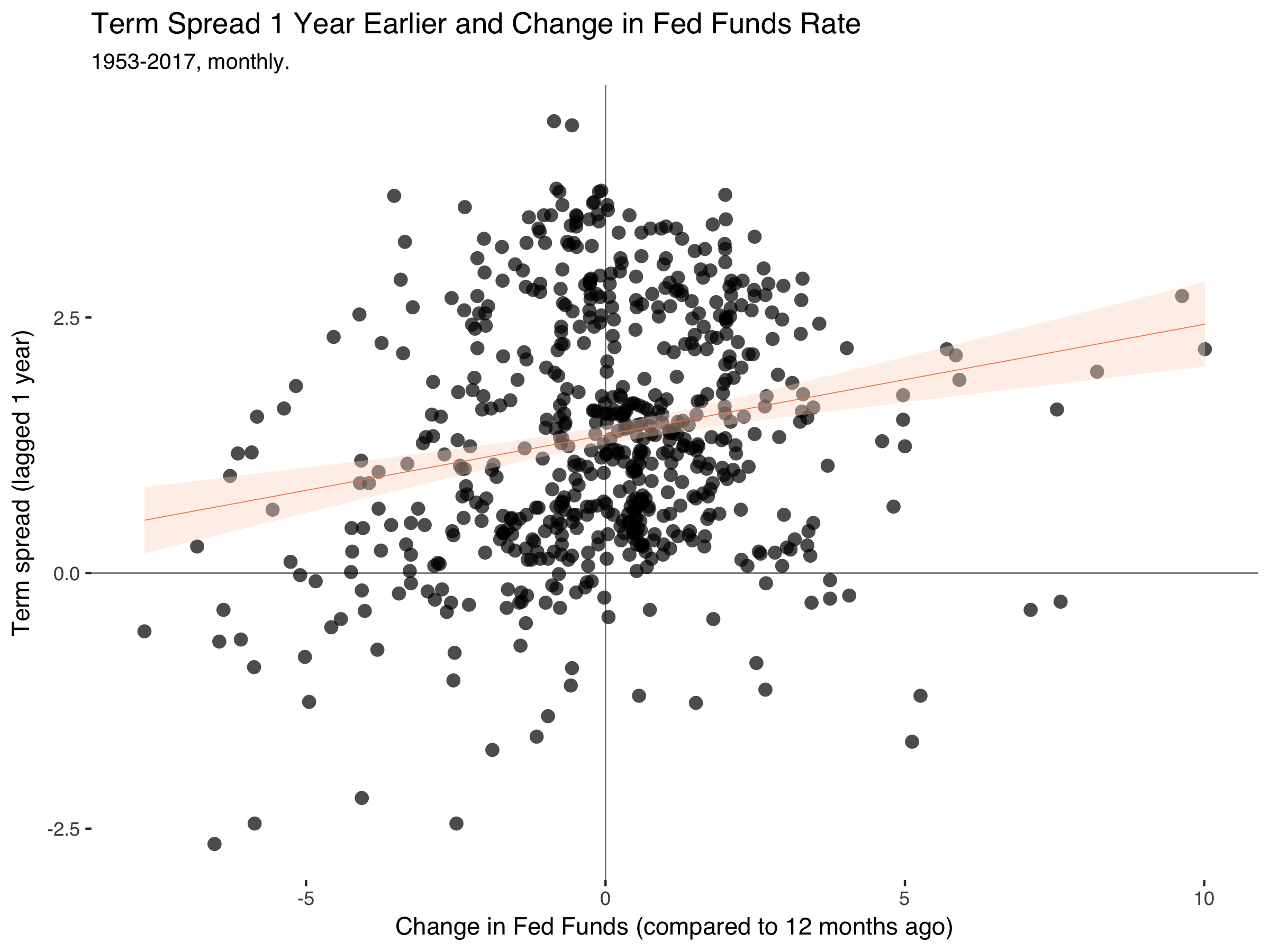
So the pattern is still there. The term spreads drop a year before the Fed Fund rate falls.
II.
Identifying plausible exogenous variation in monetary policy is the gold standard of monetary economics. A host of other ways have been proposed, but basically every course on empirical macroeconomics starts with the shock series by Romer and Romer (2004).1 This paper filters out the endogenous response of monetary policy with respect to the movement in other economic variables using a regression of the fed funds rate on variables that are important for the central bank’s decision, such as GDP, inflation and the unemployment rate.
I won’t reproduce their analysis here, but just take their shock series from the journal page. For this, we also need the following package to read Excel data:
library(readxl)The following codes go to the AER website, download the files into a temporary folder (so we don’t have to manually delete them again), unzip the the codes and extract the relevant part:
td <- tempdir()
tf <- tempfile(tmpdir=td, fileext=".zip")
download.file("https://www.aeaweb.org/aer/data/sept04_data_romer.zip", tf)
unzip(tf, files="RomerandRomerDataAppendix.xls", exdir=td, overwrite=TRUE)
fpath <- file.path(td, "RomerandRomerDataAppendix.xls")
rr <- read_excel(fpath, "DATA BY MONTH")
Plot the shock series:
ggplot(rr, aes(DATE, RESID)) +
  geom_line() +
  theme_minimal() +
  labs(title = "Romer and Romer (2004) monetary shock",
       subtitle = "1966-1996, monthly.",
       x = "month",
       y = "Romer-Romer shock")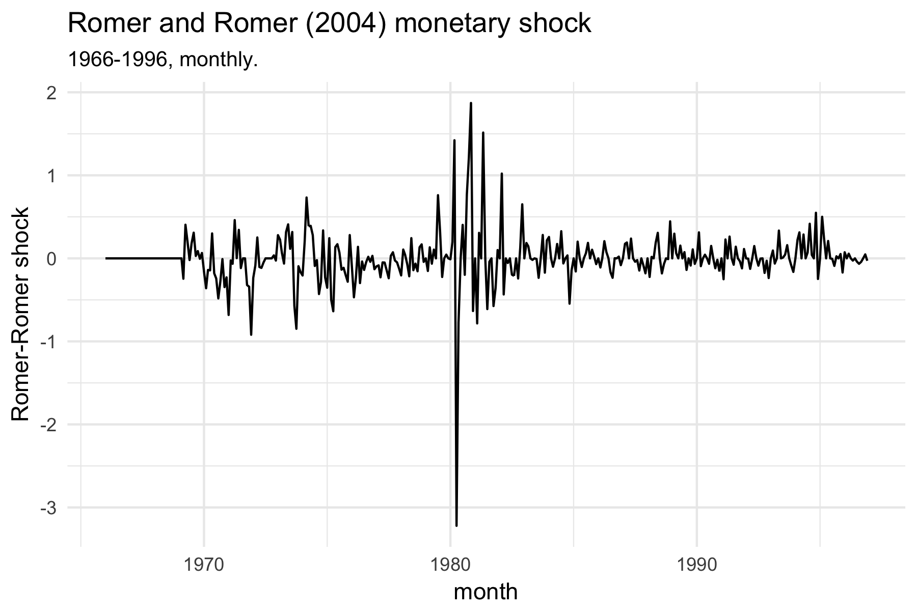
Merge the rr dataframe with our previous fd dataset:
fd <- fd %>%
  left_join(rr %>%
              gather(var, val, -DATE) %>%
              mutate(val = ifelse(val == "NA", NA, val),
                     val = as.numeric(val),
                     DATE = as.yearmon(DATE)) %>%
              filter(var == "RESID") %>%
              spread(var, val) %>%
              select(date = DATE, shock = RESID))
Make the plot:
ggplot(fd, aes(shock, trm_spr)) +
  geom_hline(yintercept = 0, size = 0.3, color = "grey50") +
  geom_vline(xintercept = 0, size = 0.3, color = "grey50") +
  geom_point(alpha = 0.7, stroke = 0, size = 3) +
  geom_smooth(method = "lm", size = 0.2, color = "#ef8a62", fill = "#fddbc7") +
  theme_tufte(base_family = "Helvetica") +
  labs(title = "Term Spread 1 Year Earlier and Romer-Romer Monetary Policy Shock",
       subtitle = "1966-1996, monthly.",
       x = "Romer-Romer shock",
       y = "Term spread (lagged 1 year)")
Which creates:

Now the pattern is gone.
What I’m learning from this is that term spreads are informative about the endogenous component of monetary policy. Investors have sensible expectations about when the central bank will lower interest rates due to a slowing economic activity.
References
Bernanke, B., J. Boivin and P. Eliasz (2005). “Measuring the Effects of Monetary Policy: A Factor-Augmented Vector Autoregressive (FAVAR) Approach”, Quarterly Journal of Economics. (link)
Christiano, L., M. Eichenbaum and C. Evans (1996). “The Effects of Monetary Policy Shocks: Some Evidence from the Flow of Funds”, Review of Economics and Statistics. (link)
Nakamura, E. and J. Steinsson (2018). “High-Frequency Identification of Monetary Non-Neutrality: The Information Effect”, Quarterly Journal of Economics. (link)
Romer, C. D. and D. H. Romer (2004). “A New Masure of Monetary Shocks: Derivation and Implications”, American Economic Review. (link)
Uhlig H. (2005). “What Are the Effects of Monetary Policy on Output? Results from an Agnostic Identification Procedure”, Journal of Monetary Economics. (link)
-
Some other approaches are: Orderings in a vector autoregression (VAR), sign restrictions, high frequency identification and factor-augmented VARs. ↩