Stephen Broadberry and John Joseph Wallis have written an interesting new paper (pdf). They argue that much of modern economic growth is due to not only a higher trend growth rate, but also due to fewer periods of shrinking.
It’s easy to reproduce some of their results using the nice maddison package.
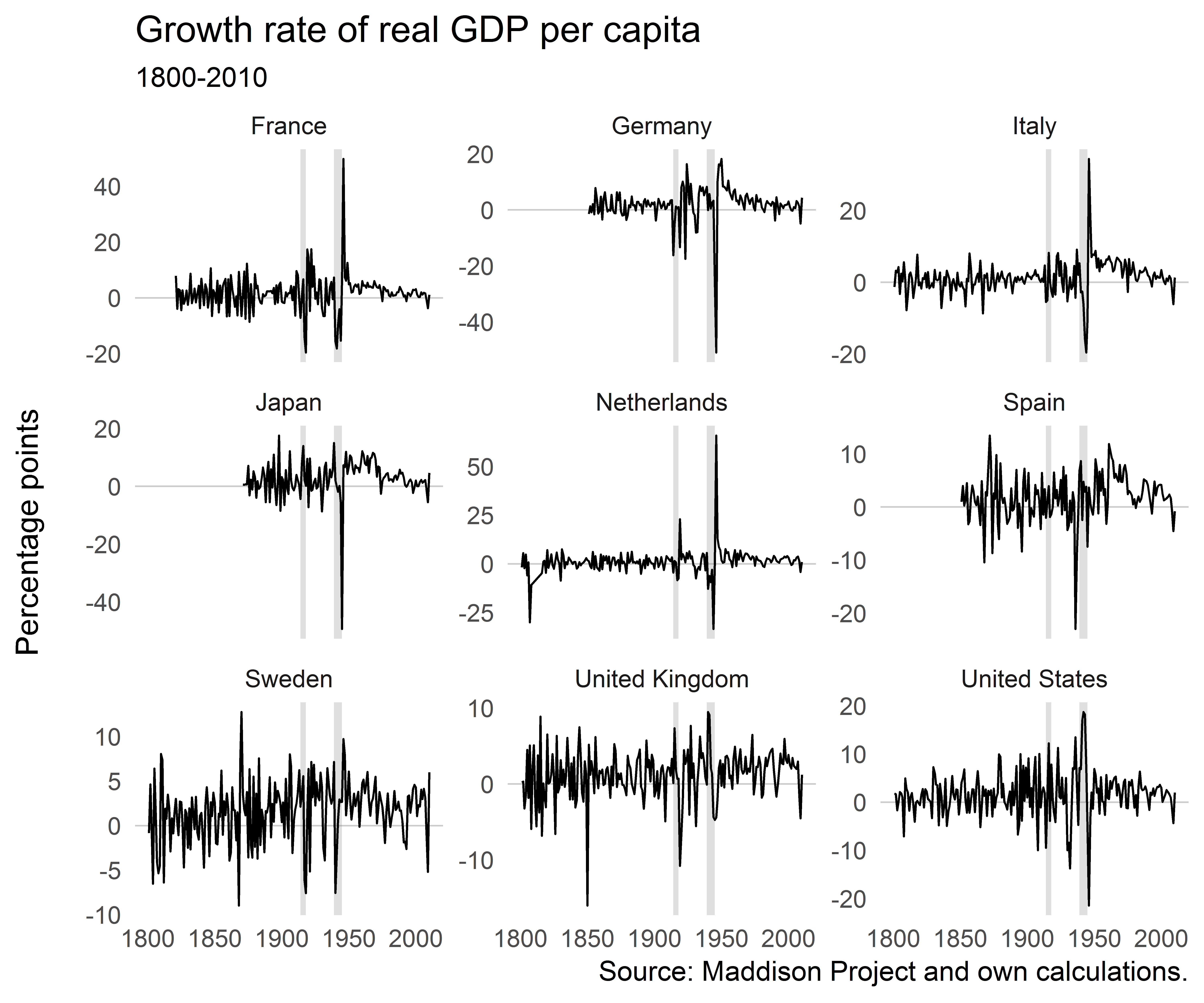
Let’s concentrate on some countries with good data coverage, keep only data since 1800 and calculate real GDP growth rates. We also add a column for decades, to be able to look at some statistics for those separately.
df%>%filter(iso2c%in%c("DE","FR","IT","JP","NL","ES","SE","GB","US"))%>%ggplot()+geom_hline(yintercept=0,size=0.3,color="grey80")+geom_rect(aes(xmin=xmin,xmax=xmax,ymin=ymin,ymax=ymax),data=df_annotate,fill="grey50",alpha=0.25)+geom_line(aes(year,gr),size=0.4)+facet_wrap(~country,scales="free_y")+ggthemes::theme_tufte(base_family="Helvetica",ticks=FALSE)+labs(x=NULL,y="Percentage points\n",title="Growth rate of real GDP per capita",subtitle="1800-2010")
Growth rates wobble around a mean slightly larger than zero, as expected. There are some extreme events around the World Wars. But it’s not immediately apparent from looking at these figures if shrinking has become less. If anything, it’s macroeconomic volatility that has decreased for most of these countries.
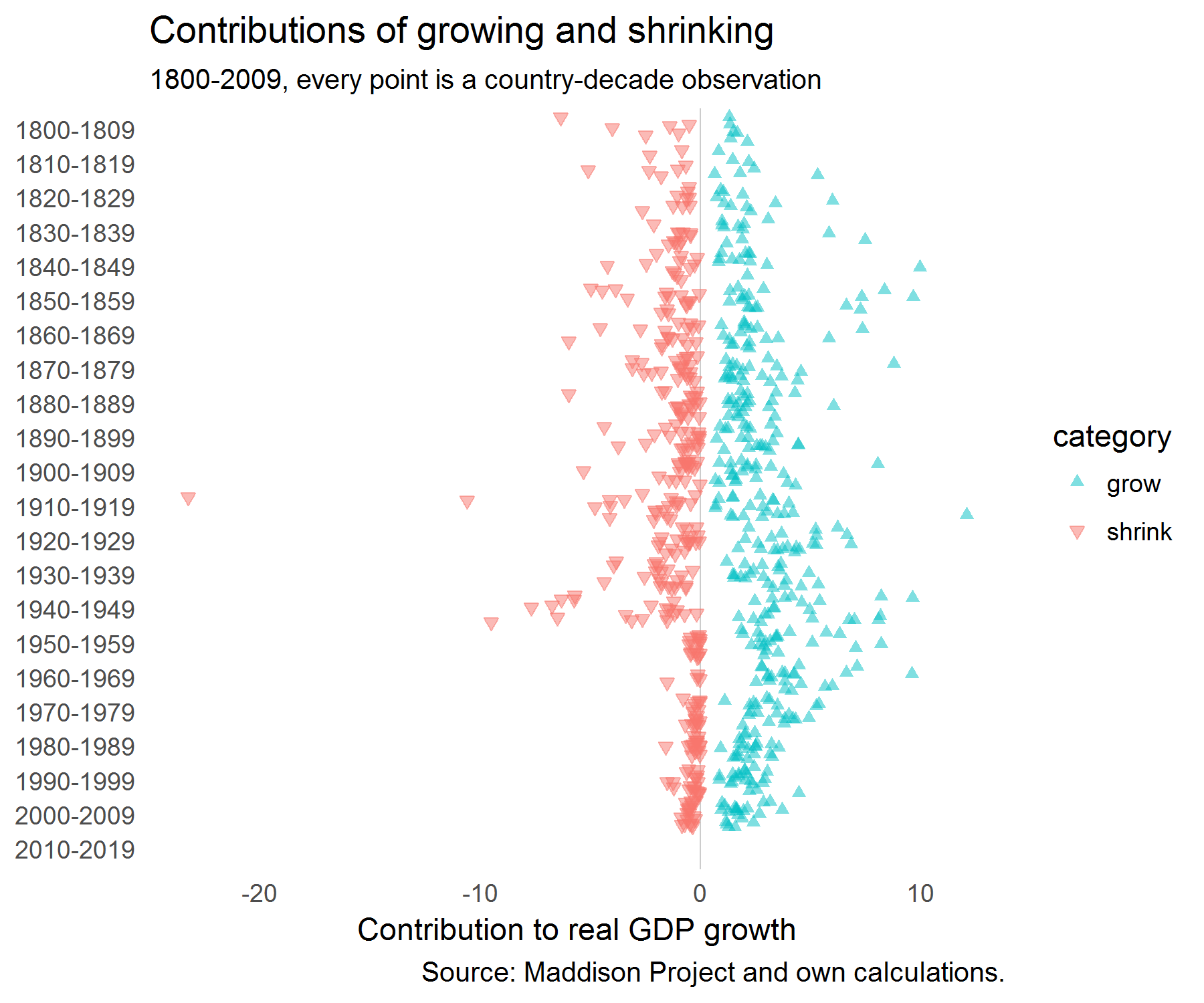
Next, for each decade we calculate the number of periods that countries were growing and shrinking and the average growth rates in those periods.
We’re interested in how much growing and shrinking years contributed to overall growth in a decade. So this is just the absolute value of changes by either shrinking and growing years divided by the total variation.
stats<-stats%>%full_join(stats%>%group_by(decade,iso3c,country_original,country,gr_av)%>%summarise(tvar=sum(abs(comp)),gr_comp=sum(comp)))%>%mutate(contr=abs(comp)/tvar)mutate(dfac=factor(decade))%>%filter(decade!="2010-2019")ggplot(stats,aes(dfac,comp,color=category,shape=category,fill=category))+geom_hline(yintercept=0,size=0.3,color="grey80")+geom_jitter(alpha=0.5)+coord_flip()+ggthemes::theme_tufte(base_family="Helvetica",ticks=FALSE)+scale_shape_manual(values=c(17,25))+scale_colour_manual(values=c("#00BFC4","#F8766D"))+scale_fill_manual(values=c("#00BFC4","#F8766D"))+labs(title="Contributions of growing and shrinking",subtitle="1800-2009, every point is a country-decade observation",y="Contribution to real GDP growth",x=NULL,caption="Source: Maddison Project and own calculations.")+scale_x_discrete(limits=rev(levels(stats$dfac)))
When we plot those contributions, we get the following picture:
It looks as if the contributions of shrinking have clustered closer to zero since WW2.
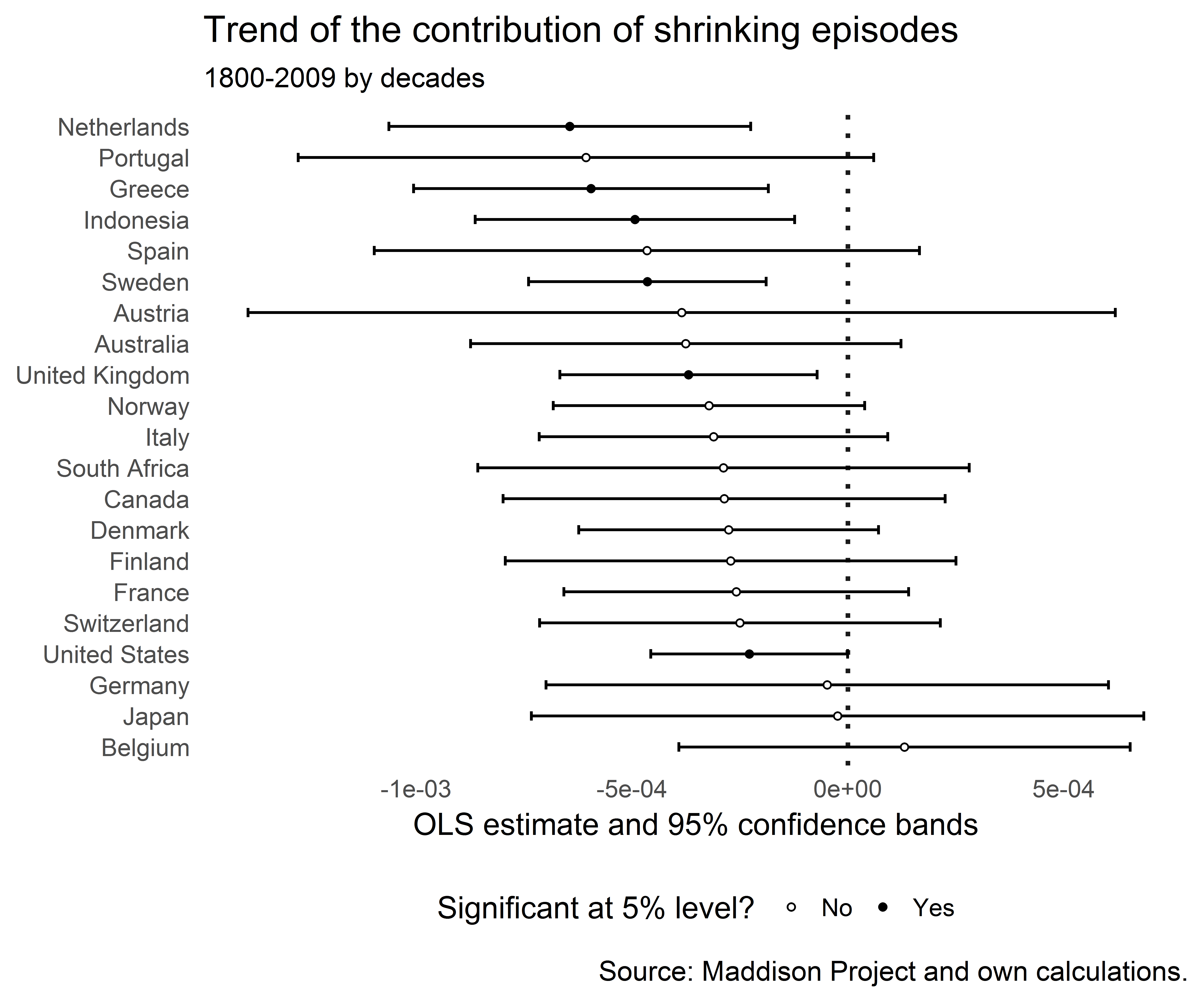
Let’s check out the trends in the contribution of shrinking periods:
And plot the regression coefficients of the trend line:
r%>%filter(term=="trend")%>%arrange(estimate)%>%ggplot(aes(reorder(country,-estimate),estimate))+geom_hline(yintercept=0,size=0.8,color="grey10",linetype="dotted")+geom_errorbar(aes(ymin=conf.low,ymax=conf.high),width=0.3)+geom_point(aes(y=estimate,fill=sig),shape=21,size=1.0,color="black")+coord_flip()+theme_tufte(base_family="Helvetica",ticks=FALSE)+labs(title="Trend of the contribution of shrinking episodes",subtitle="1800-2009 by decades",x=NULL,y="OLS estimate and 95% confidence bands",caption="Source: Maddison Project and own calculations.")+scale_fill_manual(name="Significant at 5% level?",labels=c("No","Yes"),values=c("white","black"))+theme(legend.position="bottom")
The trend was negative for many countries and for some there was no significant trend. None of the trends was significantly positive. It certainly looks as if episodes of growing output have become more important than episodes of shrinking episodes.
The question remains whether this might not just be mechanically driven by the fact that a higher trend real GDP growth rate reduces the probability of the growth rate hitting zero. And a fall in macroeconomic volatility would also make shrinking episodes less likely.
References
Broadberry, S. and J. J. Wallis (2017). “Growing, Shrinking, and Long Run Economic Performance: Historical Perspectives on Economic Development”, NBER Working Paper No. 23343. doi: 10.3386/w23343
The assessment of that effect … is not as straightforward as many people think. And I’m not a fan of economic models, because they have all proven wrong. (link)
This past weekend, the biggest story on social media was not about a powerful man who had sexually assaulted someone, or something the president said on Twitter. Charmingly, as if we were all at a Paris salon in the 1920s, everyone had an opinion about a short story.
We’ve written a VoxEU column for our patent paper, which you can find here.
Overview statistics
When I started writing this article I became curious how a typical VoxEU column looks like. So I scraped the archives and looked at some statistics. Here they are (as of November 15 2017):
After some cleaning, there are 5633 columns from January 2008 to November 2017.
The mean number of page reads of columns is 20,600 (median: 16,600).
The mean number of authors is 2.1 (median: 2). There are about 1800 single-authored columns.
The teaser text at the top of the columns contained 68 words on average (median: 66).
The main part of the column is a little harder to count, because it also contains tables, figure captions and references. When I just count all words before the first appearance of “References” in the text, I get a mean of 1383 words (median: 1327). That seems well within the recommended range of 1000-1500 words.
The most prolific writers have written up to 50 columns and the mean number of columns per author is 2.2 (median: 1).
Every column is assigned to one topic and several tags. I aggregated the 49 topics to one of 19 categories (e.g., I counted “EU institutions” and “EU policies” as “Europe” and “Microeconomic regulation” and “Competition policy” as “Industrial organisation”). This produces the following figure:
Some observations:
The graph reflects the focus of voxeu.org. The top categories are “International economics” (950), “Europe” (930), “Development” (590), “Financial markets” (580).
Microeconomic theory and econometrics are only rarely covered.
The spike of the “Europe” category around 2012 might be related to the euro area sovereign debt crisis around that time.
The topic “Frontiers of economic research” is a bit more vague.
“Labor” and “Economic history” columns have become more important and columns with the topic “Global crisis” have become rarer.
Measuring complexity of text in columns
One fun exercise I’ve run is inspired by this blog post by Julia Silge. She explains how to use a “Simple Measure of Gobbledygook” (SMOG) by McLaughlin (1969) to find out which texts are hard to read. This works by counting the average length of syllables per words that people write. Words with fewer syllables are seen as easier to understand. The SMOG value is meant to show how many years of education somebody needs to understand a text.
I’m running this analysis separately on the columns teaser texts and their main body. Our own teaser text has 16 polysyllable words in four sentences and we calculate the SMOG value like this:
The rest of the column has 251 polysyllables in 65 sentences, which yields a SMOG of 14.4.
The winner of the VoxEU teaser text with the lowest SMOG count is this column by Jeffrey Frankel. It has a SMOG of 6.4, so taking the measure literally we would expect a kid fresh out of primary school to be able to understand it.
The column with the lowest SMOG value in its main column text is this column by James Andreoni and Laura Gee. It has 147 polysyllables spread out over 79 sentences, which yields a SMOG of 10.9.
I won’t name any offenders, but the highest SMOG score is 26.8. Understanding that text would require the substantial amount of education such as: 12 (school) + 3 (undergrad) + 1 (master) + 5 (PhD) + 6 (assistant professor) to understand.
The overall average SMOG value is 14.8 on teasers and 16.0 on main columns texts. So it seems that economists write on a level that college graduates can understand. SMOG doesn’t vary much by field, but it takes the highest value (on full columns) in “Industrial organisation” (16.9), “Monetary economics” (16.4) and lowest in “Economic History” (15.8) and “Global Crisis” (15.7).
The SMOG on the two column parts has a correlation of 0.27.
The OLS line is flatter than the 45 degree line which is probably a sign of the more accessible language in the teasers.
Interestingly, when we compare articles’ SMOG values with the number of times the page was read, we get the following negative relationship:
This also holds in a regression of log(page reads) on the SMOG values of both main text and teaser text, the number of authors, number of authors squared and dummies for the day of the week, quarter, year and – most importantly – the literature category (e.g. “Taxation”, “Financial markets” or “Innovation”). It’s not driven by outliers either and there is also a significantly negative relationship if I measure SMOG on the teasers only.
Writing columns that take an additional year of schooling to understand (SMOG + 1) is associated with 3 percent fewer page reads. Maybe that’s a reason to use fewer big words in our papers!
One explanation might be that more complex papers require the use of more big words. And that users on voxeu.org prefer clicking on articles that don’t sound too complicated. But better written papers might also just be inherently better in other dimensions. And because they’re more important, people read them more often.
References
McLaughlin, G. H. (1969). “SMOG Grading - a New Readability Formula”. Journal of Reading. 12(8): 639—646.
“Hitler’s Soldiers: The German Army in the Third Reich”, by Ben Shepherd. It find it hard to say I enjoyed this book, but it impressed me. Facts really stand out when Shepherd is able to put numbers on them. For example, did you know that, “During the winter of 1941-2, 360,000 Greeks died of famine”?
“Submission”, by Michel Houellebecq. What I found eerie is the psychological plausibility of the decisions in this story.
“Folding Beijing”, by Hao Jingfang. A fantastic (in both senses of the word) short story about reality and inequality by a Chinese macroeconomist.
“Hans Fallada: Die Biographie”, by Peter Walther (in German). I really enjoyed reading Fallada’s book “Alone in Berlin” and Fallada’s life was equally interesting. This superb biography spares nothing by simplifying too much.
“Commonwealth”, by Ann Patchett. We accompany the lives of six siblings over several decades. I started not expecting to finish, but after the first chapter I couldn’t stop.
“Gorbachev: His Life and Times”, by William Taubman. So much was new to me which mostly just reveils my ignorance about the topic.
At this point I know Jerome Powell only from news reports, though I was pleased to realize a few days ago that the locked-down Twitter account @jeromehpowell created in 2011 is following me, as well as several of my friends in the blogosphere. If he is reading this, let me say that I would be glad to craft a blog post on any topic he would like to hear my opinion on, and would be happy to do so while keeping his query confidential.
Joseph Gagnon has written a blog post at the Peterson Institute about the Phillips curve in the United States.
Some economists have observed that the employment gap turned positive this year, but inflation has not increased. Gagnon argues that we should not be too quick to infer from this that the Phillips curve relationship has broken down, as high employment may take a while to raise prices. And he adds that this relationship is weaker in low inflation environments due to hesitancies to lower prices (i.e., nominal rigidities).
He kindly provides data and codes at the bottom of his codes, but let’s try to reproduce his figure using only public data from FRED.
Download quarterly CBO estimates for the natural rate of unemployment from FRED and calculate the employment gap as current employment rate minus natural rate.
We see that the employment gap was negative for a long time after the financial crisis but has recently turned positive. That’s the bit of data that Gagnon and others are arguing about.
Now we create the variables that Gagnon uses. We lag the employment gap by four quarters and calculate the inflation rate as the year-on-year change in the price level:
Last, we check in which periods inflation (four quarters before) was above three percent. And we truncate the data to the same sample as in Gagnon’s analysis.
ggplot(df,aes(egap_l,cpi_change,color=high_inflation,shape=high_inflation))+geom_hline(yintercept=0,size=0.3,color="grey50",linetype="dotted")+geom_vline(xintercept=0,size=0.3,color="grey50",linetype="dotted")+geom_point(alpha=0.5,stroke=0,size=3)+theme_tufte(base_family="Helvetica",ticks=FALSE)+geom_smooth(method="lm",se=FALSE,size=0.4,show.legend=FALSE)+labs(title="US Phillips curves with low and high inflation",subtitle="1963Q1–2017Q3",caption="Source: FRED and own calculations following\nGagnon (2017) \"There Is No Inflation Puzzle\".",x="employment gap",y="change in inflation")+geom_text(data=subset(df,yq=="2017 Q3"),aes(egap_l,cpi_change,label=yq),vjust=-10,hjust=2,show.legend=FALSE)+geom_segment(aes(x=-1.2,xend=df$egap_l[df$yq=="2017 Q3"],y=1.85,yend=df$cpi_change[df$yq=="2017 Q3"]),arrow=arrow(length=unit(0.1,"cm")),show.legend=FALSE)+scale_colour_manual(name="Inflation:",labels=c("< 3%","> 3%"),values=c("#F8766D","#00BFC4"))+scale_shape_manual(name="Inflation:",labels=c("< 3%","> 3%"),values=c(17,19))
We see indeed that there’s a relationship, but it’s more pronounced in the high inflation regime. And the most recent datapoint “2017 Q3” shows that – a year ago – the employment gap was still slighty negative with -0.16 and the change in inflation in 2017 Q3 was also negative with -0.20.
I would generally characterize my state of mind for the last six to eight months as … poor. Not just because of current events in the United States, though the neverending barrage of bad news weighs heavily on my mind, and I continue to be profoundly disturbed by the erosion of core values […].
In times like these, I sometimes turn to video games for escapist entertainment. One game in particular caught my attention because of its unprecedented rise in player count over the last year.
[...]
I absolutely believe that huge numbers of people will still be playing some form of this game 20 years from now.
[...]
It’s hard to explain why Battlegrounds is so compelling, but let’s start with the loneliness. […] PUBG is, in its way, the scariest zombie movie I’ve ever seen, though it lacks a single zombie. It dispenses with the pretense of a story, so you can realize much sooner that the zombies, as terrible as they may be, are nowhere as dangerous to you as your fellow man.
[...]
Battle Royale is not the game mode we wanted, it’s not the game mode we needed, it’s the game mode we all deserve. And the best part is, when we’re done playing, we can turn it off.